
2023
EDITORIAL
Sundial: A Bi-Annual Catalog from Thos. Baker
Thos. Baker is a premium outdoor furniture brand based in Oregon and a marketing client of BUNTIN at the time. The brand's mission has been to create furniture that embraces the soul of the outdoors. The company prides itself on its furniture's high level of permanence in customers' lives.
The client's immediate needs focused on their evergreen furniture lineup. To promote these, our team strategized a solution to showcase the furniture in an editorial-style circular—akin to a magazine—elevating the context of the pieces and intimately painting the picture with the evergreen collections.

01
THE NAMING PROCESS
The project commenced with a unique approach to the naming process, which was intricately intertwined with the cover design.
We understood that the first impression is often lasting, and we wanted to ensure that the catalog's name resonated with the brand's essence.
Over the weeks, I collaborated with the team's copywriter and art director to hone the catalog's purpose and context and concoct a catalog name. After several rounds of edits to the cover, we landed on sun-dial—a title reflecting the furniture's year-round usefulness, regardless of it being day or night.
02
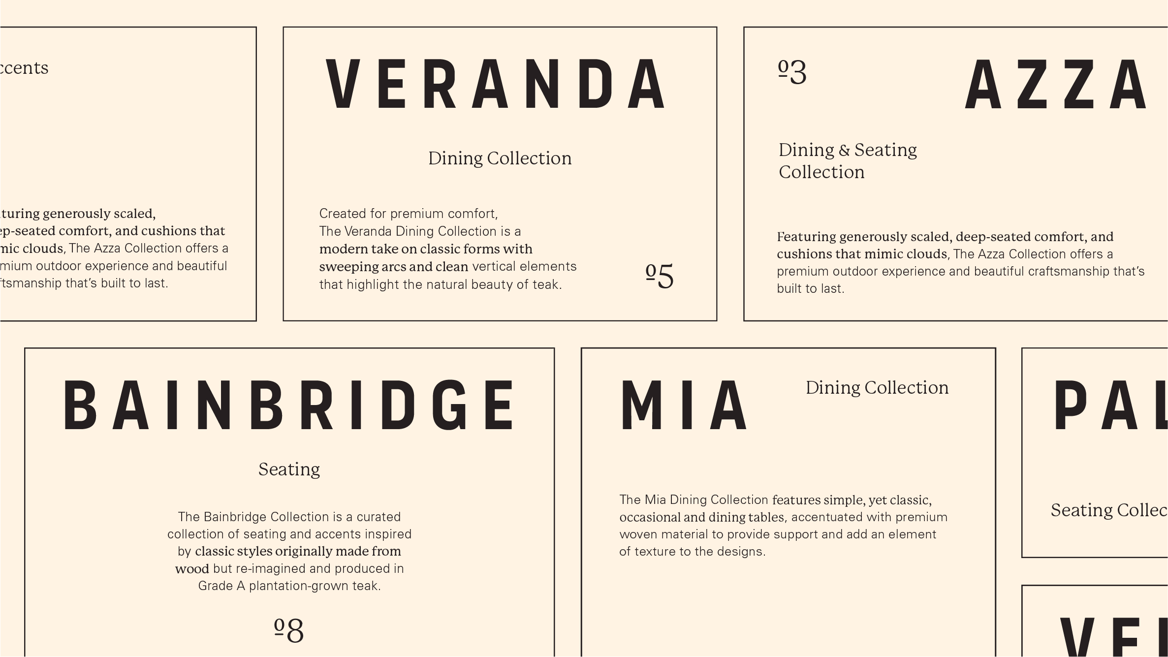
THE UNDERLYING GRID
Ample space and minimal elements were the principal methods to strike Thos' Baker's luxury.
Working closely with Thos' Baker's team, we carefully selected and refined the photography to align with our design vision. This collaborative effort was instrumental in drafting the underlying grid, which served as the cornerstone of the project, effectively communicating the brand's focus on luxury and style.
03
TYPOGRAPHY
The most exciting part of the project was to see how serif and sans-serif can be combined to form a unique yet legible copy treatment.
To strike this combination copy treatment, I equipped the type arsenal with powerhouses—such as Organetto, P22 Mackinac, and Univers. Organetto—from Latinotype—is a variable typeface with robust condensed versatility applied to all headers. The font's thick, geometric plane perfectly draws the eyes into the section. Mackinac—from P22 Type Foundry—smoothly informs the category and provides a hook into the collection. Mackinac is also used for the catalog's cover name. Lastly, Universe—from Linotype—is applied on supplemental copy (information that needs to be legible and nothing else).
04
COLOR
Cozy, bright, and chic—these attributes were the driving force behind the layout's palette, just like the evergreen collection.
Bright shades were studied and implemented throughout the layout to spruce the design and add a final sense of distinction to individual collections. Hues were assigned based on careful analysis of the supplementary photography available for each collection.

05
APPLICATION
From naming to color, all project elements served as a testament to the dynamic nature of designing a bespoke editorial layout, which simply cannot be limited to setting type within a grid.
The creative journey of this catalog—development of an agile grid, pairing of sleek type treatments, and studying the nuanced color palette—resulted in all elements coming together to form an ensemble that conveys the timeless nature of Thos' Bakers' outdoor furniture.
