2025
BRANDING
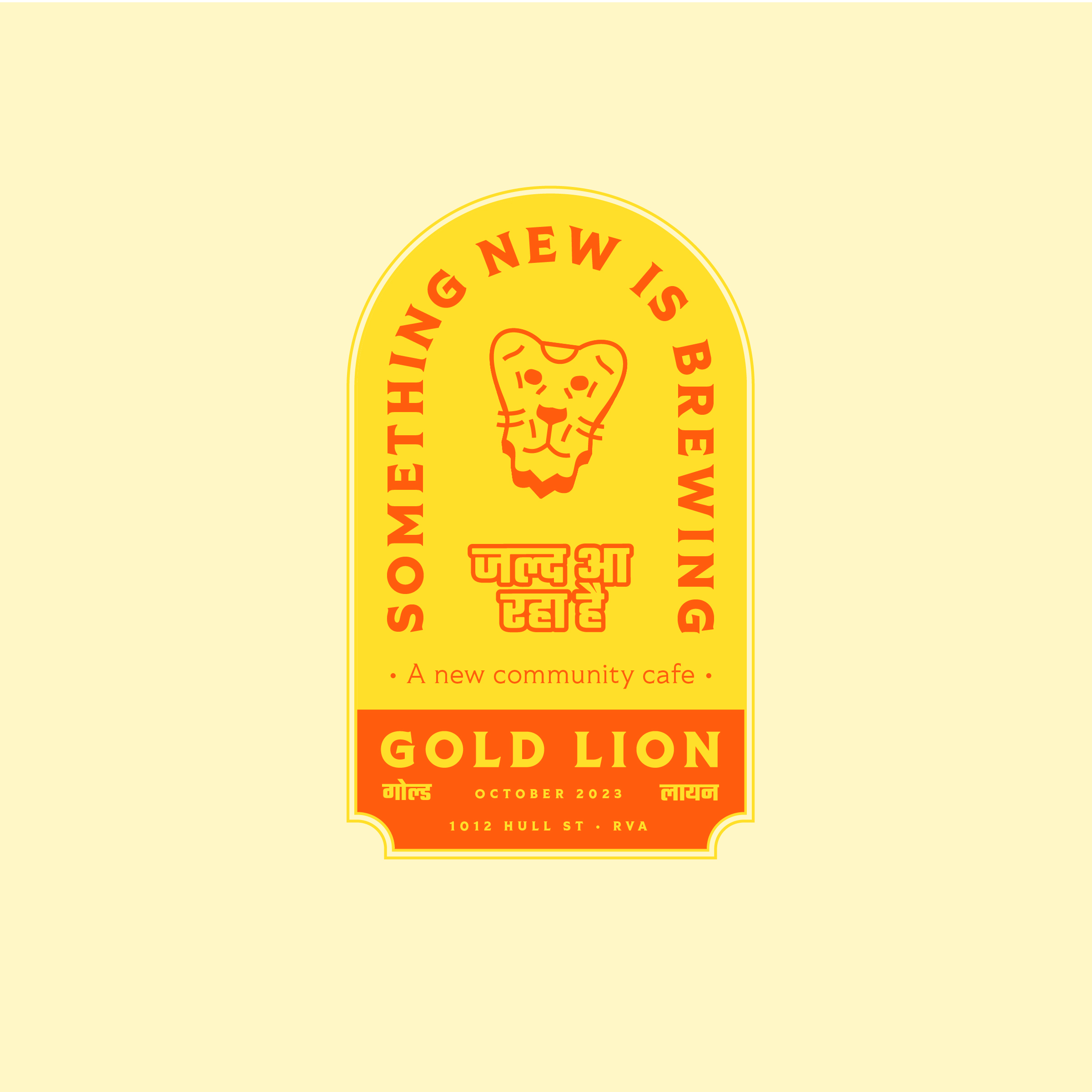
Gold Lion
Community Cafe
Gold Lion Community Cafe, nestled in the heart of Richmond, Virginia, is more than just a cafe and bar serving Indian-inspired fare. It is a place where everyone is welcome and the community can come together. Owners Matt and Nafis have a clear vision for their cafe's branding, which reflects this welcoming and inclusive spirit, blending conventional Indian aesthetics with a contemporary cafe experience.
When Matt and Nafis approached us with the branding request, the task was straightforward: to blend the culture of a community cafe with Indian hospitality. With a name set and a visual direction from the owners, we journeyed from the lion iconography to creating the entire brand book. This comprehensive branding process allowed us to draw inspiration from our cherished South Asian heritage, resulting in a unique and meaningful brand identity for Gold Lion Community Cafe.
01
VISUAL SYSTEM
The genesis of the visual system revolves around the lion.
In many cultures, the lion represents protection within strength and unity. Drawing from those attributes, the cafe strives to harbor a safe space where anyone can feel open. The Indian tradition of hospitality is infused and embraced. The core idea of the cafe's visual system is to combine the lion iconography with branding that's bespoke to the cafe's mission.
02
TYPOGRAPHY
Drawn to be the namesake symbol, the lion represents the cafe's core mission.
The Gold Lion, the cafe's namesake symbol, was carefully ideated, sketched, and digitized after numerous iterations to ensure the right proportions and expression. The lion's digital design allows it to be scaled for any marketing environment, serving as a visual anchor for the brand. Various logo lockups and frame styles were planned and prescribed, ensuring the lion's versatility and consistency across all branding elements.
03
COLOR
The brand draws from essential warm tones of the South Asian culture.
The primary hues are used throughout the brand for most of its correspondence. Accent colors were studied and applied—to be used sparingly—for various decorative needs.

04
APPLICATION
The choice of Tiller Pro from Fort Foundry as the primary typeface was deliberate, as its variable axes allow for seamless adaptation to most treatments, ensuring versatility in the branding. Teko, an open-source typeface from Google, was chosen to serve as a decorative display typeface for the supplementary Devanagari script, adding a touch of cultural relevance to the branding.
.jpg)